Color is more than just a visual element—it’s a powerful tool for communication and emotion. Designers who understand the psychology of color can influence perception, evoke feelings, and guide user behavior.
1. How Colors Evoke Emotions
Colors trigger emotional responses based on cultural associations and personal experiences. Here’s a quick breakdown of common colors and their meanings:
- Red: Passion, urgency, or excitement (used in sales, food brands, or entertainment).
- Blue: Trust, calmness, and professionalism (ideal for corporate brands and healthcare).
- Yellow: Optimism, energy, and warmth (great for playful or youthful brands).
- Green: Nature, health, and balance (popular with eco-friendly or wellness industries).
- Black: Elegance, luxury, and sophistication (perfect for high-end brands).
Understanding this emotional impact allows designers to align colors with their client’s message.
2. Cultural Context Matters
Color meanings can shift based on culture. For instance, while white signifies purity in Western cultures, it represents mourning in some Eastern traditions. Designers working for global brands must consider cultural associations to avoid miscommunication.
3. Using Contrast and Harmony
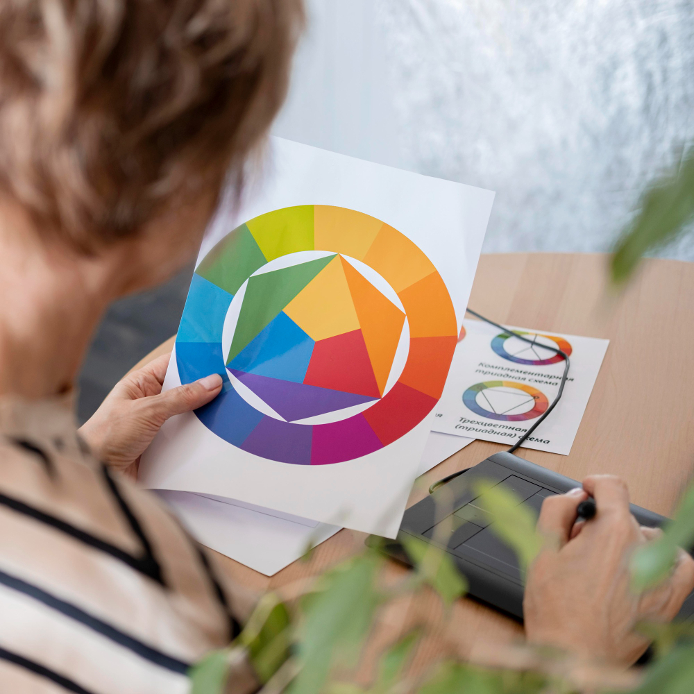
Designers use color theory to strike the right balance between harmony and contrast. The color wheel provides essential tools:
- Analogous colors (e.g., blue, teal, green) create harmony.
- Complementary colors (e.g., blue and orange) create contrast.
- Monochromatic schemes use varying shades of one color for subtle elegance.
Effective color combinations ensure the message is clear and visually appealing.
4. Color for Brand Recognition
Brands use color to stand out and establish identity. Think of Coca-Cola’s red, Facebook’s blue, or McDonald’s yellow. These choices are deliberate, evoking emotions that align with the brand’s personality. Consistent use of color builds trust and brand recognition.
5. Guiding Behavior with Color
Color can influence decision-making, especially in web and UI design. For example:
- Call-to-action buttons (CTAs) often use bold, high-contrast colors like red or orange to grab attention.
- Cool tones (e.g., blue or green) are calming and encourage exploration.
By guiding users’ focus and behavior, designers can enhance usability and drive results.
Mastering color psychology is essential for effective design. It’s not just about making something “look good”—it’s about influencing perception, driving engagement, and leaving a lasting impression.

